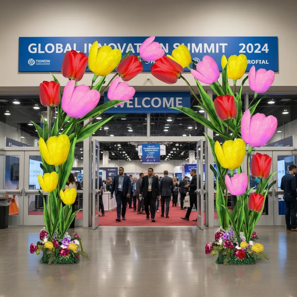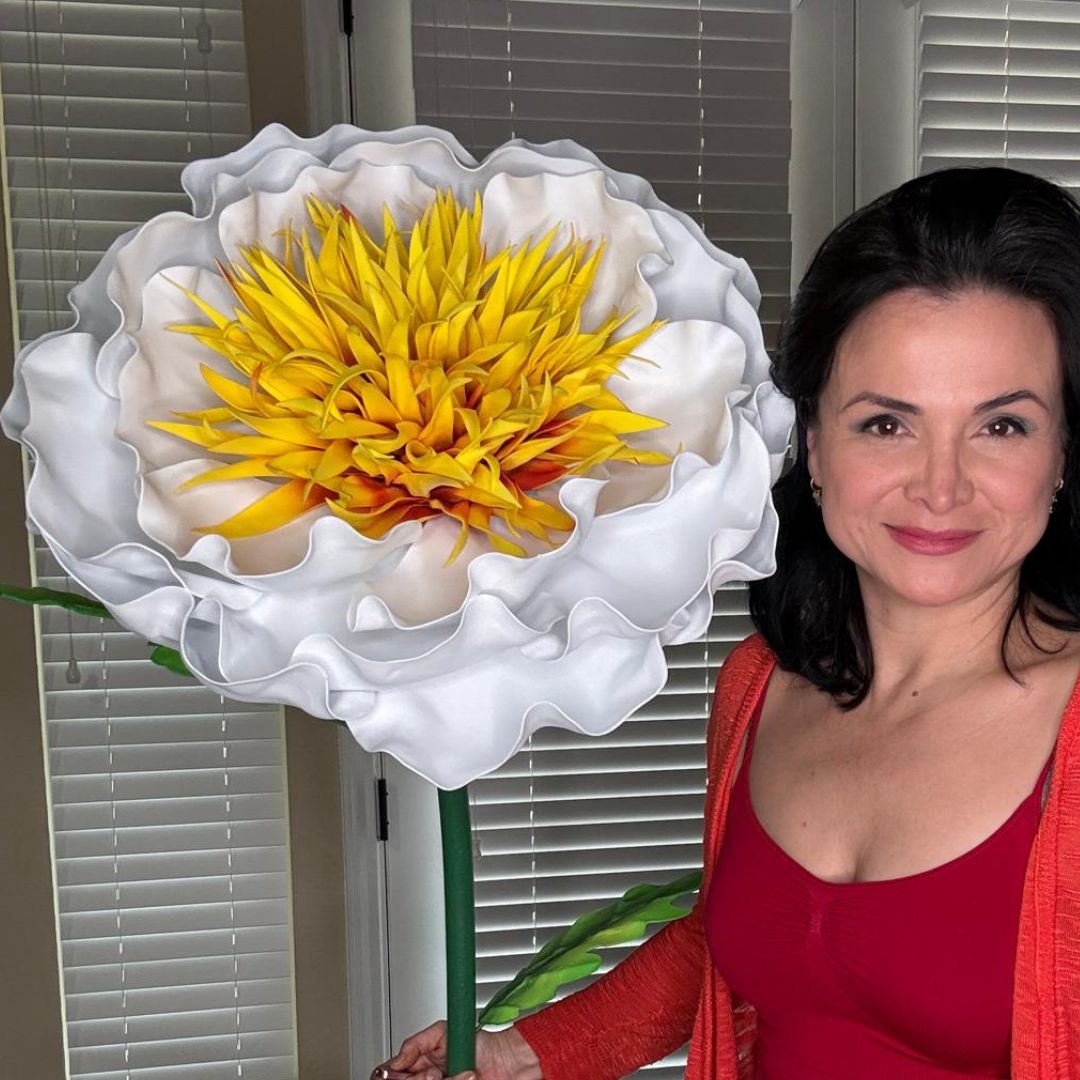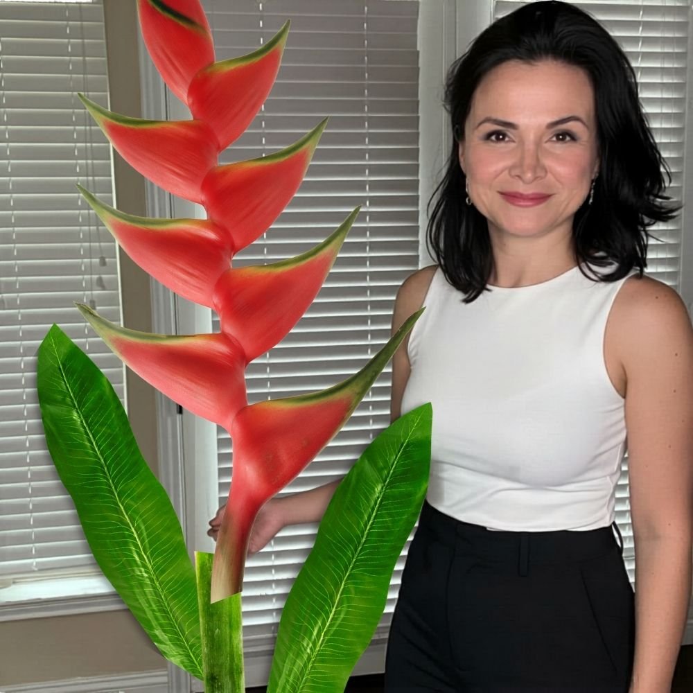
Mix-and-Match Flower Wall Colors for Any Theme
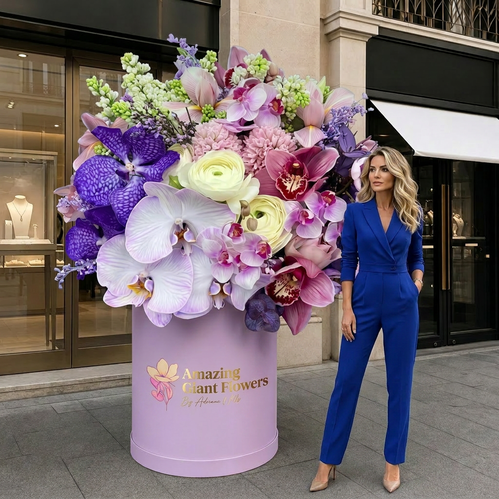
If you've been searching for flower wall color ideas that actually work across multiple events — not just one birthday or one bridal shower — you're in the right place. I built Amazing Giant Flowers because I kept seeing party planners (and DIY hosts) buy decorations once, use them once, and toss them. That felt like such a waste to me. So I designed our kits specifically so you can remix, repaint, and reimagine them for literally every event on your calendar.
Here's what I love most about working with party planners: you think in themes. You're not just doing "pink flowers." You're doing dusty rose garden party, hot pink bachelorette, blush-and-gold wedding reception — all in the same month. And you need your inventory to stretch across all of it. That's exactly what our Wall Flower Kits are built for.
So let's dig into the real stuff. How do you pull off endless color palettes from just a few kits? How do you mix and match sizes and shades so every backdrop looks intentional, not thrown together? I'm going to walk you through everything I know — from color theory basics to specific palette combos that photograph beautifully.
Key Takeaways
Color is the first thing a camera picks up. Before the guests, before the cake, before the welcome sign — the backdrop registers. And if your flower wall looks muddy, flat, or mismatched, every photo from that event looks off.
I've watched party planners lose repeat clients not because the flowers were bad, but because the palette felt random. Two shades that almost matched. A pop of color that didn't belong. It happens so easily when you're pulling from different product lines or rushing a setup.
The good news? When you control your inventory — when everything comes from the same foam material and the same kit system — color becomes something you design on purpose. That's the whole idea here.
The EVA Foam Advantage for Color Flexibility
Our Wall Flower Kits are made from EVA foam, and this matters a lot for color. EVA foam is smooth, lightweight, and it holds paint like a dream. You can go from white to terracotta to sage green to deep burgundy — all with the same physical kit.
If you want to go deep on painting techniques, I highly recommend checking out our guide on flawless foam board paint finishes — it covers everything from primer to topcoat so your colors stay vibrant event after event.
And if you're curious about the foam itself, our EVA foam collection gives you the raw material to cut custom petals, extend existing kits, or experiment with new shapes.
Ok, this is where it gets really fun. You don't need a design degree to pull off a stunning flower wall. You just need three formulas. I use these constantly when I'm helping planners figure out their palette.
Pick one hue and work through its full range. Think blush → dusty rose → deep mauve. Or ivory → cream → warm white. Monochromatic walls are the most elegant and they photograph beautifully in natural light.
For a bridal shower or baby shower, this is my go-to recommendation. It feels intentional and luxurious without being loud. If you want inspo, our post on bridal shower backdrop ideas has some gorgeous monochromatic setups to reference.
2. Analogous — Colors That Live Next to Each Other
Analogous palettes pull from colors that sit side by side on the color wheel. Coral + peach + yellow. Lavender + soft purple + dusty blue. These combos feel natural and harmonious — like a garden, not a craft store.
This formula works beautifully for quinceañeras, garden parties, and spring events. The key is to let one color lead and use the others as accents.
Complementary colors sit opposite each other on the wheel. Purple and yellow. Orange and blue. Pink and green. These combinations are electric — perfect for birthday parties, graduation celebrations, and brand activations where you want people to stop scrolling.
Real talk? This is the formula I see party planners underuse the most. They play it safe with matching tones when a bold contrast would've made the whole room unforgettable.
💡 Pro Tip
When mixing complementary colors on a flower wall, use a 70/30 ratio. Let one color dominate 70% of the wall and use the complementary color as a 30% accent. Equal splits tend to feel chaotic. The imbalance is what makes it look designed.
Flower Wall Color Ideas by Event Theme
Let me get specific. Because "use a monochromatic palette" is great advice in theory, but when you're standing in front of a client who wants a Barbie party, you need actual colors. Here's how I'd approach some of the most common themes.
This palette is a powerhouse for photo backdrops. If you want to go all in, check out our thoughts on the best photo booth backdrops — hot pink flower walls are consistently the most-photographed setups at any event.
For more graduation inspo, we put together a whole post on graduation party backdrop ideas with giant flowers — definitely worth a read before your next booking.
Color is only half the equation. The other half is scale. A wall covered in identical 18" flowers looks flat. A wall that mixes 18", 24", and 30" flowers looks alive.
When I'm laying out a wall, I always start by placing my largest flowers (30") in a loose triangle pattern across the wall. Then I fill in with 24" flowers, and finally use 18" flowers to fill gaps and create density where I need it.
Never cluster all your big flowers in one area. Spread them out so the eye travels across the whole wall.
Here's a rule I swear by: never put your two most similar colors directly next to each other. If you're doing blush and dusty rose, separate them with your ivory or cream flowers. The contrast between them reads better when they're not competing side by side.
And your darkest color? Use it sparingly, and never in the center of the wall. Dark flowers at the edges create a natural frame. Dark flowers in the middle create a visual hole.
🌸 Ready to build your palette?
Browse our Wall Flower Kits starting at $37.99 — available in 18", 24", and 30" to mix and match for any theme.
Comparing Flower Wall Color Palettes at a Glance
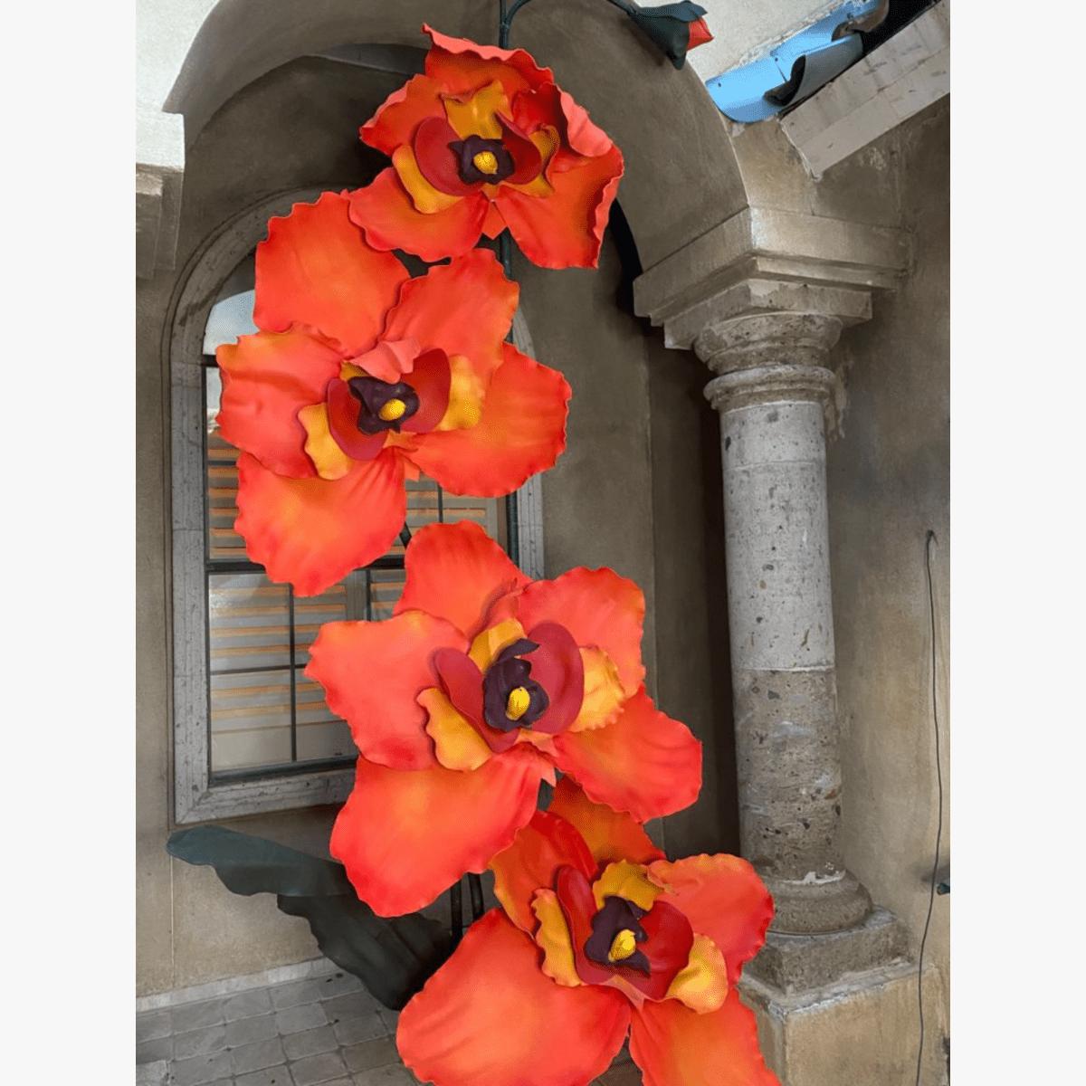
I put this table together because I get asked constantly — "what colors should I order for X event?" Here's my quick reference guide.
| Event Type | Lead Color | Support Colors | Accent | Best Size Mix |
|---|---|---|---|---|
| Bridal Shower | Blush | Ivory, dusty rose | Gold centers | 18" + 24" |
| Quinceañera | Fuchsia or royal purple | Lavender, soft pink | Silver or white | 24" + 30" |
| Baby Shower | Soft blue or mint | White, pale yellow | Cream | 18" + 24" |
| Graduation | School colors | White, gold | Metallic edges | 24" + 30" |
| Corporate Event | Brand primary color | White, neutral | Brand secondary color | 30" statement + 18" fill |
| Bachelorette | Hot pink | Fuchsia, bubblegum | White or gold | All three sizes |
| Garden Wedding | Ivory / cream | Blush, sage green | Terracotta | 18" + 24" + 30" |
Stretching Your Kit Investment Across Multiple Events
This is the part I get most excited talking about with party planners, because it's where the real ROI lives. When I first started building these kits, I wanted them to be reusable, repaintable, and remixable — not single-use props.
Repainting Between Events
EVA foam is incredibly forgiving with paint. You can apply a new base coat and completely transform a flower's color in under an hour. I recommend a light sanding between paint jobs if you've done multiple layers — it keeps the surface smooth and the new color crisp.
Our guide on painting on foam core walks through the exact technique so your flowers look freshly made every single time.
Building a Core Inventory
Here's how I'd suggest building a starter inventory for a party planner who wants maximum flexibility:
- 6–8 flowers in 18"
Ready to Create Something Amazing?
Browse our collection of giant flower kits and start your next project today.