Visual Merchandising Ideas for Boutiques: Boost Sales

Most boutique owners know the feeling. You invest in a beautiful display, step back, and think, “That looks great.” Then the day ends, and the products you hoped to move are still sitting there.
That gap matters. A boutique doesn’t need more decoration. It needs visual merchandising ideas for boutiques that shape customer movement, highlight margin-rich products, create memorable moments, and make the whole store easier to shop.
The strongest boutiques treat display work like store choreography. A statement piece isn’t there just to fill space. It should stop traffic, set the mood, pull shoppers deeper into the store, and help the right products get seen at the right moment.
A boutique display usually fails before anyone touches a prop or moves a rack. It fails when the store has no visual point of view and no commercial objective behind the setup.
That’s why the first job is to define your visual story. Not a vague mood. A clear point of view that tells shoppers what kind of world they’ve stepped into. Romantic and handcrafted. Sharp and modern. Playful and giftable. Quiet luxury. Festival color. Bridal softness. If you can’t describe the feeling in a few words, your display team won’t be able to build it consistently.

Define the customer before the display
A strong boutique visual strategy starts with one question. Who is this display for when they walk in today?
A bridal shopper browsing slowly needs a different environment than a gift buyer who wants a quick win. A boutique serving event planners can support bigger, more theatrical focal points. A shop selling handmade accessories may need a softer scale, but it still benefits from one bold anchor that organizes the rest of the space.
Use a simple working profile:
If you know the barrier, you can build the display to remove it. That’s the difference between decoration and merchandising.
Mood boards often look polished and fall apart on the sales floor. The fix is simple. Build them around materials and constraints, not just inspiration photos.
Include:
- Color hierarchy: One dominant tone, one support tone, one accent
- Surface mix: Matte, glossy, woven, metallic, paper, acrylic, wood
- Hero shape language: Rounded, sculptural, clean-lined, layered
- Product role: Which items are stars and which are support pieces
- Seasonal flexibility: What can stay, what should rotate
A good mood board makes decision-making faster. If a prop doesn’t fit the board, it doesn’t go on the floor.
Practical rule: If your display needs a long explanation to make sense, it isn’t ready for the shop floor.
For boutiques using dramatic installations, the mood board matters even more. Large features carry visual weight. If they clash with your product palette, they overpower the merchandise instead of lifting it.
Many visual merchandising guides still frame displays as aesthetic upgrades. A better approach is to use feature installations to convert, especially when you want to pull shoppers toward complementary merchandise or premium offerings, as discussed in this analysis of feature-led retail display techniques.
Start with one primary objective per display cycle:
Statement pieces earn their keep. A giant floral arch, oversized bloom wall, or sculptural flower tower should have a job. It might mark the bridal zone, pull traffic toward the back table, or frame a premium capsule collection so it feels special.
Use this order every time:
Name the campaign
Give it a working title so the team can align around one idea.
Choose the commercial target
New arrivals, bundles, event bookings, giftable items, or premium products.
Select one hero installation
One focal element should lead. The rest should support.
Map supporting products
Add the pieces that make the hero easier to buy into.
Check sightlines
Stand at the window, the threshold, and the fitting room corridor. The display should read differently from each point, but still make sense.
Save references in one place
Keep concept images, swatches, signage drafts, and fixture notes together. A visual resource bank like an inspiration gallery for large-format floral displays helps teams align on style faster.
The boutiques that do this well aren’t guessing. They’re making fewer random choices, avoiding clutter, and using every major display to support a specific result.
A boutique layout should guide without feeling pushy. Shoppers want freedom, but they also want cues. The best store plans subtly tell them where to look next.
That starts with accepting one hard truth. Customers don’t experience your shop as a floor plan. They experience it as a sequence of moments. Window. Threshold. First turn. Main wall. Pause point. Discovery zone. Checkout.

Build around six customer moments
Treat the store like a guided path, not a collection of fixtures.
Window display
This is the invitation. Keep the message clean. One story, one focal direction, one reason to step inside.
Entry zone
Don’t overload the threshold. Shoppers need a beat to adjust. If the entrance is crammed with racks, bins, and signage, they won’t process the rest.
Power wall or main focal point Here, a statement installation does real work. A sculptural flower feature, oversized bloom cluster, or dramatic arch can establish the store’s visual hierarchy immediately.
Aisle and fixture flow
The path should feel intuitive. Fixtures need enough spacing to let shoppers slow down, pivot, and return.
Impulse zones
These should sit where decision-making is already happening, not in forgotten corners.
Checkout
The end of the journey should still feel branded, not like a dead utility area.
A lot of boutiques get the first and third moments right and lose control in the middle. That’s where layout discipline matters.
A dramatic installation works best when it acts as a visual magnet. Don’t place your biggest feature where shoppers already intended to stop anyway unless the goal is pure branding. Use it to pull them toward a zone that needs attention.
For example:
A lot of store owners make an error. They place the boldest visual in the easiest location, usually right at the front, and never ask whether it’s helping the rest of the floor sell.
A statement piece should create movement, not just admiration.
The most effective layouts combine design instinct with observation. Retailers using heat mapping have found that products placed at eye level have 82% higher purchase rates, which is why strong visual teams study where customers naturally pause before assigning hero product placement, as outlined in this breakdown of heat mapping and retail hotspot strategy.
You don’t need fancy software to start noticing patterns. Stand off the floor and watch:
Then adjust.
Jewelry boutiques often handle this well because they have to make small products feel important. If you want useful crossover ideas, these tips for elevating your jewelry boutique displays are worth studying for scale, lighting logic, and product emphasis.
Oversized features fail when they try to do everything at once. Pick the primary function.
If a feature is doing none of those, remove it or redesign it.
For boutiques that want stronger storefront performance, it helps to study more examples of retail window display ideas that lead into the in-store journey. The key isn’t the size of the display. It’s whether the display creates a next step.
Create a Destination Immersive Sensory and Shareable Displays
A boutique can look polished and still feel forgettable. That usually happens when the display only works on sight.
The stronger play is sensory layering. Visual scale gets attention first, but touch, sound, and even subtle scent are what make people stay present in the space. Most merchandising advice barely gets past lighting and color. That leaves a major opening for boutiques willing to design a fuller experience, especially with tactile, sculptural features that invite closer interaction, as noted in this discussion of multisensory retail merchandising ideas.

Oversized installations already do one job well. They create scale. But scale alone can turn passive if the rest of the environment doesn’t support it.
A boutique display becomes more persuasive when the customer can move through it and feel texture changes along the way. A flower wall beside stiff acrylic shelving can feel staged. A flower wall paired with soft textiles, layered papers, natural stems, woven baskets, or velvet risers feels more complete.
Use sensory contrast deliberately:
- Soft next to structured so product surfaces feel more noticeable
- Matte beside reflective so the eye keeps moving
- Quiet music with bold visuals so the store doesn’t feel chaotic
- Light fragrance near feature zones so the mood feels intentional, not accidental
The mistake is overdoing it. If every corner has a competing scent, soundtrack shift, and texture story, the boutique feels confused.
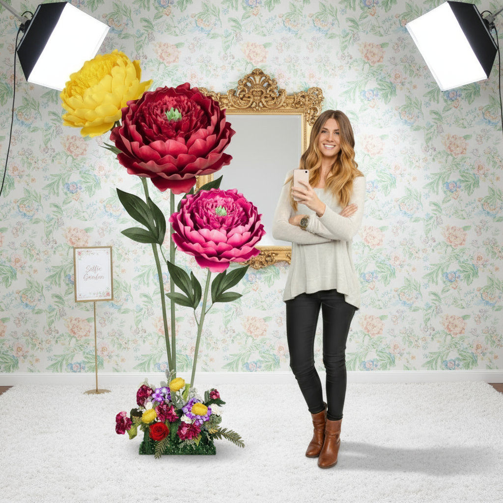
A lot of stores accidentally create photo backdrops. Few build them properly.
A shareable display needs more than a pretty wall. It needs a place to stand, enough clearance for framing, lighting that flatters people and merchandise, and a backdrop that still looks branded when photographed on a phone. That’s why selfie stations outperform random “Instagrammable” corners. They’re planned.
Use this checklist:
Merchandising note: If shoppers photograph the backdrop but the product never appears in frame, the display is branding only. Move the merchandise closer or restage it.
A strong floral installation can do double duty here. It marks a destination in the store, and it creates content customers want to post without being asked three times.
For boutiques exploring more examples of floral-led environments, this gallery of visual merchandising with flowers in retail spaces shows how large botanical forms can frame product rather than bury it.
Keep the sensory language consistent
The best immersive stores don’t add random “experience” elements. They repeat a few cues consistently.
If your boutique story is romantic and handcrafted, use rounded forms, tactile materials, warm lighting, and softer music. If the shop is modern and graphic, use cleaner lines, stronger contrast, more negative space, and crisper signage. The installation should match that language.
This is also where video and movement help. A moving visual reference can help a team understand pacing, scale, and how interactive display moments feel in a real environment.
Here’s the trade-off most boutiques run into. The more immersive the display, the easier it is to tip into clutter or novelty without sales intent.
What works:
- One anchor zone that earns attention
- Touch-friendly materials near hero product
- Clear photo moment with enough breathing room
- Subtle sensory support that reinforces the brand
What doesn’t:
The practical standard is simple. The display should feel memorable before checkout and recognizable later in a customer’s camera roll.
Static boutiques fade into the background. Customers stop noticing displays they’ve already seen, even when the products are good.
Seasonal rotation solves that, but only if the update feels like a fresh story instead of the same setup with different colors. Well-designed visual merchandising already increases time spent in store, and seasonal displays push that further. Shoppers spend 20% more time in shops with strong visual merchandising, and seasonal displays lead shoppers to spend 14% more time in store, according to this roundup of visual merchandising performance statistics.

The strongest seasonal ideas do two things at once. They create visual novelty and support a product story shoppers can buy into immediately.
Here are five that work well in boutiques.
Spring reset with height and softness
Use upward movement, lighter tones, and open sightlines. Oversized tulips, lilies, or airy floral forms work well because they imply freshness without crowding the floor. If you’re refreshing your storefront, these examples of a spring window display for retail inspiration are useful for thinking about seasonality without cliché.Summer festival energy
Bold color carries this story. Sunflowers, saturated pinks, warm oranges, and photo-worthy props support casual buying and event-themed merchandising. This is a strong season for giftables, accessories, and impulse add-ons.
Wedding and event season
Build around application, not just beauty. Show how the products fit a ceremony, shower, reception, or styled backdrop. A boutique often sells better when customers can see the use case instead of a generic pretty arrangement.Autumn texture story
Fall doesn’t need to be pumpkins everywhere. Use rust, ochre, olive, dried elements, dark woods, paper florals, and layered heights. This season works especially well for richer tactile merchandising.
Holiday polish
Edit hard. Holiday displays fail when every fixture becomes a theme park. Pick one holiday story, one hero palette, and one premium gifting zone.A seasonal rollout isn’t just about looking updated. It can remove common shopping friction.
Seasonal merchandising works best when the products feel native to the story, not dropped into it.
One of the most underused boutique tactics is the in-store workshop. Not because every store should become an event venue, but because a hands-on activation changes how customers relate to product.
A DIY flower-making workshop is a good example. It lets customers see materials, tools, stems, petals, and finished pieces in one environment. That turns product from shelf inventory into an experience. It also creates natural cross-merchandising because shoppers can move from kits to supplies to finished display inspiration without a hard sell.
A practical workshop setup usually includes:
The boutiques that keep attention year-round aren’t reinventing everything monthly. They’re rotating one main story, refreshing key sightlines, and tying each update to a reason to buy.
A display that gets compliments but doesn’t move product is expensive theater.
That doesn’t mean every visual element must justify itself through direct attribution. Branding matters. Atmosphere matters. But if you’re spending labor, floor space, props, and creative energy on statement installations, you need a clean way to tell what’s helping the business and what’s just taking up room.
Track the metrics that connect to action
Start with a short scorecard. Keep it simple enough that the team will use it.
Measure before the display goes live, then again after launch:
Interactive displays boost product engagement by 40%, and cross-merchandising complementary products can increase average transaction value by 20%, according to these interactive display and cross-merchandising benchmarks. Those are useful reference points, but only if you compare them against your own baseline.
Most boutiques overcomplicate measurement. You don’t need a giant dashboard to learn from a display test.
Use this process:
Choose one target
Pick the exact result you care about. More sales of a launch item. More bundle purchases. More traffic to the back of the store.
Define the display variable
What changed? A floral arch. A selfie station. A themed center table. A relocated premium rack.Keep other factors stable when possible
If pricing, staffing, signage, and promotion all change at once, the result gets muddy.
Run the display for a defined period
Long enough to observe patterns, short enough that you can still make changes while the campaign matters.Compare against the prior setup
Look at targeted product sales, bundle attachment, and customer behavior around that zone.
The cleanest boutique test is usually a zone test.
For example:
Test setup Version A Version B Hero product placement Standard table display Same product framed by statement installation Bundle strategy Hero item alone Hero item with complementary add-ons Social moment No photo zone Defined selfie backdrop near featured category Signage style Product facts only Product plus use-case styling cue This kind of comparison gives you something practical to act on. If the installation lifts attention but not sales, the issue might be product selection or adjacency. If customers photograph the setup but skip the merchandise, the display may need better product framing.
Good measurement doesn’t just tell you whether a display worked. It tells you what to change next.
Don’t ignore operational ROI
Visual merchandising ROI isn’t only about sales. Labor and upkeep matter.
A dramatic installation that takes too long to reset, blocks replenishment, or degrades quickly can become a hidden cost. That’s why practical teams assess:
- Setup time
- Daily maintenance
- Durability
- Storage needs
- Safety around traffic flow
- Ease of seasonal adaptation
A beautiful display that constantly sheds pieces, shifts out of shape, or creates congestion near checkout won’t survive long in a real boutique.
For stores leaning into photo-driven retail and experiential formats, it helps to study broader experiential marketing activations that turn displays into measurable engagement tools. The same logic applies in a boutique. If the display invites participation, you need a way to track the response.
What success actually looks like
The best-performing visual programs usually share a few traits:
- They have one clear display objective
- They use one dominant focal point
- They make the next shopping step obvious
- They connect the feature to nearby product
- They measure results and adjust fast
That’s the real shift. Visual merchandising stops being subjective once you document what changed and what happened after the change.
A boutique doesn’t need a bigger display budget as much as it needs sharper visual intent. If you want statement floral installations, custom oversized blooms, or DIY kits that help turn retail displays and selfie moments into sales tools, explore Amazing Giant Flowers.
Ready to Create Something Amazing?
Browse our collection of giant flower kits and start your next project.
Shop All Flowers