Realistic Shading on Foam Flowers: A Simple Paint Recipe
Key Takeaways
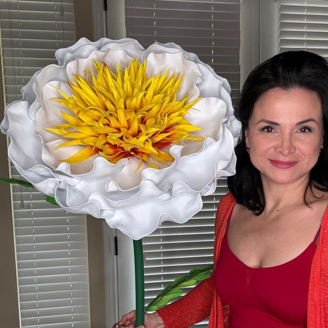
If you've ever held up a finished foam flower and thought something's missing — that flat, one-dimensional look that screams "craft project" instead of "wow, is that real?" — I promise you, shading is the answer. Learning EVA foam flower painting realistic shading techniques is the single biggest upgrade you can make to your giant flowers, and it's so much simpler than it sounds. I've been doing this for years, and once I cracked the code on my paint recipe, everything changed.
I remember my early flowers. Beautiful shapes, great structure — but they looked like painted foam. Because, well, they were. The petals had no depth, no life. A real rose has a hundred shades of pink in a single bloom. A real peony has shadows tucked into its folds that make your eye believe it's three-dimensional. That's what we're going for here.
In this guide, I'm walking you through exactly how I shade my giant EVA foam flowers — the paints I use, the brushes, the layering technique, and the little tricks I've picked up from making thousands of these things. By the end, you'll have a complete paint recipe you can apply to any flower, any color, any size.
Here's the thing about how our eyes read three-dimensional objects: we rely almost entirely on light and shadow to understand depth. When a surface is one flat color, our brain registers it as flat. Full stop.
Real flower petals are never one color. Even a "pure white" gardenia has warm cream tones at its center, cool blue-gray shadows in its folds, and almost luminous bright white at its outermost tips. Our eyes have seen real flowers our whole lives, so we know — even subconsciously — when something doesn't have that tonal variation.
Adding shading to your EVA foam flowers tricks that subconscious recognition system. Suddenly the brain says "three-dimensional object" instead of "flat painted surface." That's the entire magic of this technique, and it doesn't require any artistic background to pull off. It just requires understanding a few simple rules and practicing them consistently.
Choosing the Right Paints for EVA Foam Flower Painting
Not all paints behave the same way on foam, and choosing the wrong one is the fastest way to ruin hours of work. Let me save you the frustration I went through early on.
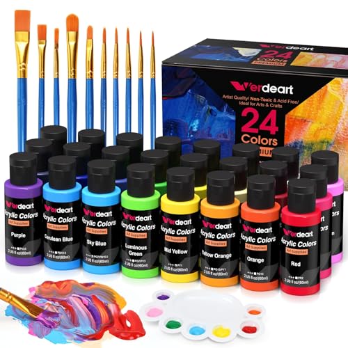
Acrylic paint is the clear winner for EVA foam flower painting realistic shading work. It's water-based, so it cleans up easily, dries within minutes between layers, and — most importantly — it remains slightly flexible when dry. That flexibility is critical because foam moves and bends, and a brittle paint layer will crack at the fold lines.
Avoid oil-based paints entirely — they stay tacky for days and don't adhere reliably to foam. Watercolors don't have enough pigment to show up on colored foam surfaces and will look washed out and uneven.
I cannot stress this enough: raw EVA foam has a slightly waxy surface that actively resists paint adhesion. If you paint directly onto unsealed foam, you will get patchy coverage, streaking, and eventually peeling — no matter how good your technique is.
The solution is simple and takes only a few minutes. Apply a thin, even coat of white gesso to every petal surface using a wide flat brush, then let it dry completely — usually 20–30 minutes at room temperature. Gesso creates a slightly textured "tooth" that paint grips onto beautifully.
Alternatively, a light, even coat of white or light-colored spray paint works well as a primer for large batches of petals. Hold the can 10–12 inches from the surface and use sweeping passes — you want a thin mist, not a heavy coat that obscures your petal texture.
This is the heart of everything. Once you understand this layering sequence, you can apply it to literally any flower color or variety. I use this exact process on every single flower I make.
Start with your main flower color at full, undiluted strength. Apply it evenly across the entire petal surface using a wide flat brush. You're aiming for solid, even coverage with no streaks. Let this dry completely before moving on — usually 15–20 minutes.
Your shadow color should be a deeper, slightly cooler version of your base color. To mix it, take your base color and add a small amount of burnt umber, raw umber, or a touch of deep violet — these darken without going muddy. Avoid using black to darken, as it kills the vibrancy of your color.
Thin this shadow mix with water to a wash consistency — roughly the transparency of tea. Apply it at the petal base (where the petal meets the center of the flower) and along any fold lines or creases. Work wet-on-dry and use a clean damp brush to feather the edges upward so there's no harsh line.
Once your first shadow wash is dry, mix an even deeper version of the same shadow tone and apply it in a narrower band right at the very base of the petal. This creates a natural gradient — darkest at the center, fading out as it moves up the petal — exactly the way real flower petals look.
Your highlight color should be a lighter, slightly warmer version of your base. Mix your base color with a small amount of white and a tiny touch of yellow or cream. Apply this with a dry-brush technique along the petal tips and raised outer edges — load your brush, then wipe most of the paint off on a paper towel before lightly dragging it across the petal surface. The color should catch on the texture and high points only.
For an extra level of realism, use a fine liner brush to add subtle veining lines in a slightly deeper version of your base color. Real petals have visible veins radiating from the base — even just three or four delicate lines per petal makes a striking difference. Keep them light and slightly irregular; perfectly straight lines look artificial.
White flowers are genuinely the trickiest to shade because you can't go lighter — all your shading work happens in the shadow direction only. The key is using cool, muted tones for shadows: a soft gray with the faintest hint of lavender or blue reads as natural shadow without looking dirty or gray.
Apply these cool shadow tones at the petal bases and fold lines, then use pure bright white for highlights at the tips. Adding the faintest blush of pale pink or cream to the innermost petals mimics the warm center that real white flowers always have — it makes an enormous difference to the overall realism. I have a dedicated guide on white flowers on wall displays that goes deeper on styling these beautifully.
Shading Deep Red and Burgundy Flowers
Deep reds are tricky because they can easily go muddy or too dark. For shadows, use a mix of deep crimson and a tiny touch of violet — never black. For highlights, a pure bright red or even a touch of coral at the petal tips stops the flower from looking too heavy and adds life.
Warm-toned flowers are actually the most forgiving and the most rewarding to shade. Use burnt orange or raw sienna for shadow tones, and a lemon yellow mixed with a touch of white for highlights. The warm-to-cool contrast within the petal reads as incredibly realistic and vibrant.
You don't need an expensive brush collection, but having the right shapes makes a real difference in how easily you can control your paint placement.
Rinse your brushes thoroughly between color changes and never let acrylic paint dry in the bristles — once it sets, the brush is ruined. A small cup of clean water next to your workspace is non-negotiable.
All that beautiful shading work deserves protection. Once every paint layer is completely dry — I usually wait a full hour after my final detail layer — apply an even coat of matte spray sealer from about 12 inches away. Matte finish is my strong preference because it looks most natural; glossy sealers can make foam look plasticky under event lighting.
Properly prepped and sealed EVA foam flowers can genuinely last five or more years. I have flowers I made in 2019 that still look gorgeous. The keys are flexible acrylic paint, proper priming, a quality sealer, and keeping finished flowers out of prolonged direct sunlight, which fades colors over time.
Yes — and I can't stress this enough. Raw EVA foam has a slightly waxy surface that resists paint adhesion. A thin coat of white gesso or a light spray paint base coat creates a surface that grabs paint evenly and prevents peeling later.
Skipping this step is the number one reason painted foam flowers look patchy and uneven, even when the painter has great technique. It takes five minutes and makes an enormous difference to the final result.
Spray paint is great for base coats, but I don't recommend it for shading layers. Shading requires controlled placement — you need your shadow color precisely at the petal base, not drifting across the whole surface. Brush-on paint gives you that control in a way spray cans simply can't.
Some crafters do use spray paint with masking tape to create gradient effects, and it can work — but it's more complex and far less forgiving than brush work. Save the spray can for priming and stick to brushes for everything else.
What do I do if my shadow looks like a harsh dark stripe instead of a gradient?
Don't panic — it's completely fixable. While the paint is still wet, use a clean, slightly damp flat brush to blend the edge of the shadow upward into the base color with gentle, sweeping strokes. Work quickly, because acrylic dries fast.
If the paint has already dried, dry-brush your base color lightly back over the shadow edge to soften it. Going forward, the best prevention is thinning your shadow mix to a wash consistency before applying — thin layers are always easier to control than heavy ones.
The key is using cool, muted tones for your shadows — a soft gray with the faintest hint of lavender or blue reads as natural shadow without looking muddy. Apply these at the petal bases and fold lines only, then use pure bright white for highlights at the tips.
Adding the faintest blush of pale pink or cream to the innermost petals mimics the warm center that real white flowers always have. It's a small touch that makes an enormous difference to how realistic the finished flower looks.
Properly prepped and sealed EVA foam flowers can last years — I have flowers I made five years ago that still look great. The keys are proper surface prep before painting, flexible acrylic paint, and sealing with a matte spray sealer when finished.
Avoid bending painted petals sharply after they're sealed, and keep them out of prolonged direct sunlight, which fades colors over time. Store them in a cool, dry place between uses and they'll reward you with a very long lifespan.
How many layers of shading should I apply?
For most flowers, two shadow layers and one highlight layer is plenty to achieve a convincing, realistic result. The first shadow layer creates the overall depth gradient; the second, narrower layer at the petal base creates the darkest point and anchors the petal visually.
If you want to go further — particularly for competition pieces or professional installations — a third very thin shadow wash and a second dry-brushed highlight layer can push the realism even further. But for everyday giant flowers, three total shading layers gets you 90% of the way there beautifully.
Shading is the skill that transforms a craft project into something people genuinely stop and stare at. I've watched people at events walk up to my giant flowers and touch them, trying to figure out if they're real. That reaction never gets old.
If you're ready to get started, head over to the Amazing Giant Flowers shop — our kits come with pre-cut petals so you can skip straight to the painting part. And if you have questions about your specific flower color or design, drop them in the comments. I read every single one. Happy painting!
Ready to Create Something Amazing?
Browse our collection of giant flower kits and start your next project today.