Layered Flower Wall: Depth Tricks the Pros Use
If you've been making giant flowers for a while, you already know the basics. You've got your petals shaped, your centers popped, your colors coordinated. But here's what separates a pretty flower wall from one that makes people stop mid-conversation and say "wait, who made that?" — depth. Layering. Dimension. These are the flower wall design tips that nobody's putting in a beginner tutorial, because honestly, you have to earn them first.
I learned this the hard way. My first big wall installation looked flat in photos. Like, painfully flat. I had 30 flowers on that wall and it looked like a printed backdrop. I wanted to cry. But that failure sent me down a rabbit hole of studying interior design principles, stage set design, and floral arrangement theory — and what I came back with completely changed how I build walls.
So if you're an advanced DIYer ready to level up, this one's for you. We're going deep — literally — on how to create walls that have real visual weight, shadow play, and that jaw-dropping pro finish that gets you tagged in every single photo.
Key Takeaways
Here's the thing most people don't realize: your eye is constantly searching for depth cues. When everything on a wall is mounted at the same distance, the same size, with even spacing — your brain reads it as a pattern. And patterns, while pretty, don't create drama.
Drama comes from contrast. Size contrast. Depth contrast. Color value contrast. The moment you introduce those three things intentionally, your wall goes from "cute backdrop" to "actual installation art."
The Interior Design Principle Behind It
Interior designers call it visual rhythm with variation. You want repetition (so it feels cohesive) but you need variation within that repetition (so it feels alive). Think of how a great bookshelf looks — books of different heights, a few objects, some negative space. Same principle applies here.
When I started applying this to my flower walls, everything changed. I stopped thinking "how many flowers fit on this wall" and started thinking "how do I create a foreground, midground, and background?"
Ok, this is where it gets really fun. I want you to stop thinking about your wall as a flat surface and start thinking about it as a stage with three distinct zones.
This is your 30" flower territory. Big, bold, mounted flush or close to the wall. These are your anchors. They set the scale and tell the eye "this is a big moment." You don't need many — three to five placed at strategic points (corners, center, asymmetric clusters) is usually enough.
Color tip: use your mid-tones and deeper hues here. Dusty rose, mauve, deep coral. Colors that visually recede slightly will make these large flowers feel like they're truly in the background, even though they're the biggest.
Your 24" flowers live here. These are mounted slightly away from the wall surface — I use foam board risers or small wooden blocks, anywhere from 1" to 3" of projection. This slight offset creates a shadow line behind the flower that you can actually see, especially under event lighting. That shadow is doing serious work for you.
This layer carries most of the "flow" of your design. Think of it like the middle notes in a perfume — you don't always consciously notice them, but without them the whole thing falls apart.
Layer 3 — The Foreground Pop
Your 18" flowers are your foreground players. Mount these on longer extensions — 3" to 6" off the wall — so they visibly project toward the viewer. Lighter, brighter colors work beautifully here. Blush, white, soft yellow. Colors that advance optically.
The result? A wall that has actual physical depth you can see from across the room. Not just implied depth. Real depth.
💡 Pro Tip
Mount your extension blocks before the event using Command strips or finish nails rated for the weight. Then attach your flowers to the blocks on-site. This makes transport way easier and your install goes from 3 hours to 45 minutes.
Real talk? Spacing is where I see advanced DIYers still making beginner mistakes. Even distribution feels "safe" but it reads as wallpaper. Here's how to break out of that.
Place your largest flowers in a loose triangle formation — never symmetrical, never perfectly even. This is a classic design principle that creates visual tension and movement. Your eye travels between the points of the triangle, which means it's actively engaging with the wall instead of just scanning it.
Group 3-4 flowers close together (almost touching), then leave deliberate negative space before the next cluster. That breathing room is not empty — it's intentional contrast. It makes your clusters feel more lush and intentional rather than randomly scattered.
I always tell people: negative space is not wasted space. It's the pause between the notes that makes the music work.
Odd Numbers Always Win
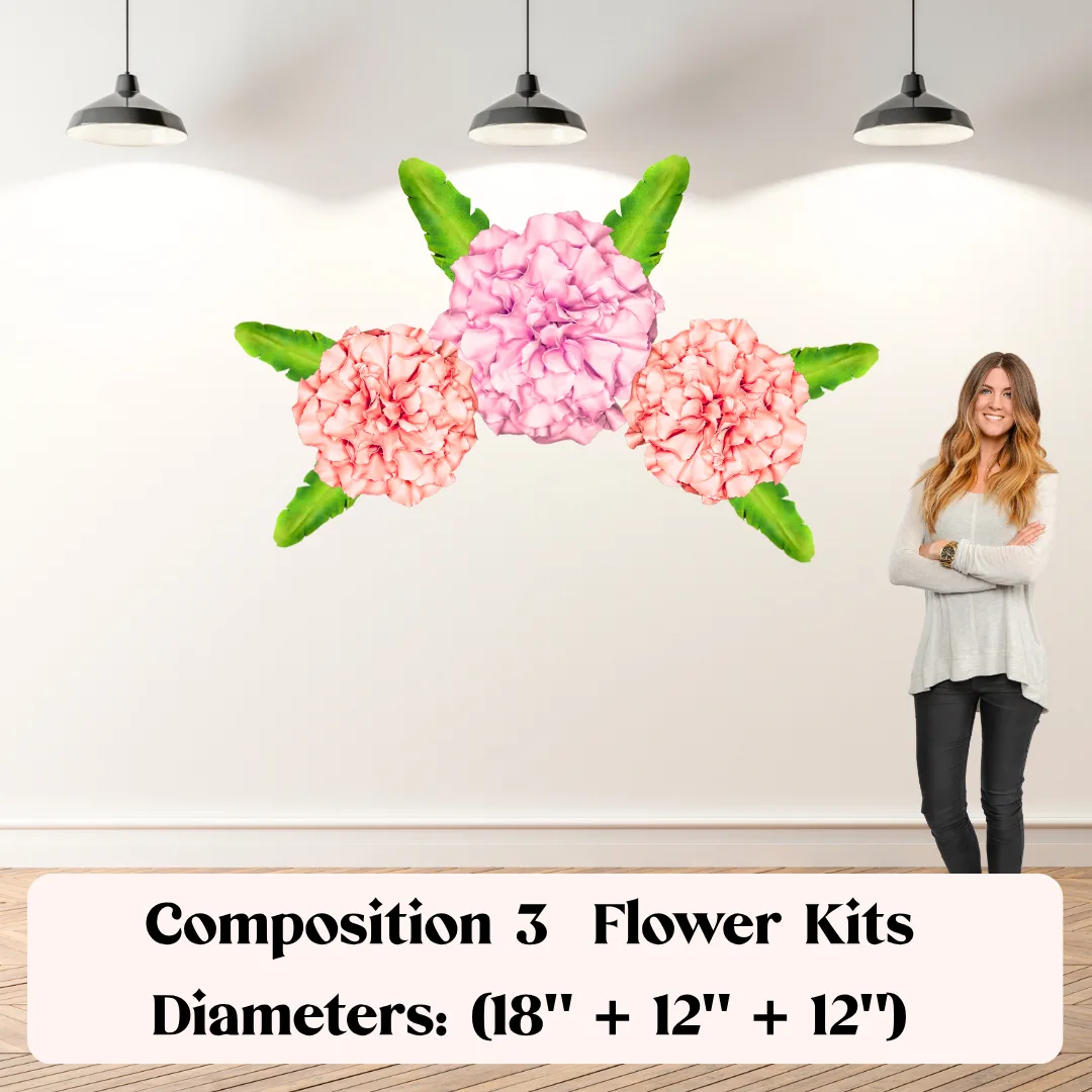
Five flowers in a cluster reads as designed. Six flowers in a cluster reads as accidental. This is one of those weird truths in visual design that I fought against at first, but now I swear by it. Always odd numbers in your groupings.
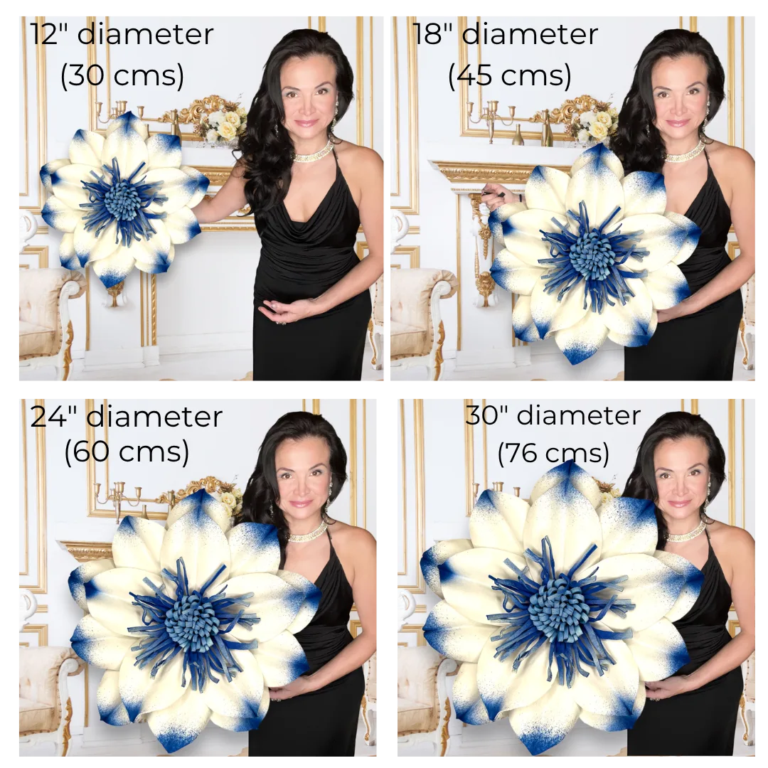
Our Wall Flower Kits come in 18", 24", and 30" — and each size has a specific job in a layered installation. Here's how I think about it:
Starting at $37.99, these kits are designed so you can mix and match sizes without worrying about style inconsistency — the petal profiles are designed to complement each other across sizes. That's not an accident. I designed them that way specifically for layered installations like this.
🌸 Ready to build your layered wall?
Browse our Wall Flower Kits in 18", 24", and 30" and start planning your depth layers today.
You can have perfect placement and still end up with a flat-looking wall if your individual flowers aren't dimensional. This is the part that separates a truly advanced build from everything else.
Most people curl all their petals the same direction. Try this instead: alternate your curl direction on every other petal layer. Some curling toward the viewer, some curling away. The result is a flower that looks like it's caught mid-bloom — alive, not static.
I go deep on this in my post about heat gun techniques for shaping foam flower petals — seriously worth reading if you haven't yet.
When you're assembling your flower, offset each petal row by a third instead of a half. Standard offset gives you a pretty flower. Third-offset gives you a flower that looks like it grew that way. There's a subtle but real difference in how organic it reads.
A flat center kills dimension. Build your centers up with multiple layers — I use 3 to 4 layers of increasingly small petals or a rolled center piece that projects at least 1.5" off the flower face. That projection catches light and creates shadow, which your camera (and your guests' eyes) absolutely love.
💡 Pro Tip
Use our EVA foam for your center build-ups — it holds shape after heat forming far better than craft foam, and it takes paint beautifully if you want a contrasting center color. Check out my guide on flawless foam board paint finishes for the exact technique.
Color Strategy for a Dimensional Flower Wall
Color is doing invisible depth work in every great installation. Here's how to use it on purpose.
Light colors advance. Dark colors recede. This is basic color theory but almost nobody applies it to flower walls. If you put your lightest flowers at the front layer (mounted furthest from wall) and your deepest colors at the back layer (mounted closest to wall), you're doubling the perceived depth — you're using both physical projection AND color value to push and pull the eye.
Two approaches that both work beautifully for layered walls:
For more inspo on how color plays into large-scale floral design, I love pointing people to my post on large floral arrangement ideas for stunning displays — lots of real examples in there.
One of the most underused tricks for creating depth? Breaking the plane of the wall entirely. When you add freestanding flower elements in front of your wall installation, you create a true three-dimensional environment, not just a backdrop.
I've done this for photo booth setups where the wall flowers are the backdrop, a freestanding column sits 18" in front of the wall, and then florals on a table sit another 24" forward. Three distinct planes. The photos are insane.
Our freestanding flower kits are designed to coordinate perfectly with the wall kits — same petal profiles, same size range — so mixing them looks intentional, not cobbled together. And if you want the full breakdown on making this work for events, my post on freestanding giant flower arrangements for events has everything you need.
Honestly, three is the magic number. One size reads flat. Two sizes reads like you tried. Three sizes — 18", 24", and 30" — gives you a true foreground, midground, and background. That's where the dimensional magic happens.
You don't need equal quantities of each. For an 8x8 wall, I typically do fewer 30" (3-5), a medium amount of 24" (5-8), and the most 18" (8-12) since they fill and transition beautifully.
What's the best way to mount flowers at different depths?
My go-to is foam board risers for lighter flowers and small wooden blocks (think craft store wooden cubes) for heavier ones. You can stack them to get your exact depth. Attach the riser to the wall first with the appropriate hardware, then hot glue or screw your flower mount to the riser.
For temporary installations, Command strips rated for the weight work on smooth walls. For permanent or semi-permanent installs, finish nails or small screws give you much more confidence. Always check your wall type first — drywall, brick, and concrete all need different hardware.
Will the layered look still work in photos,
Ready to Create Something Amazing?
Browse our collection of giant flower kits and start your next project today.