Color Trends 2026: How to Match Giant Flowers to This Year's Palette
If you've been scrolling through event inspiration boards lately, you already know that color trends 2026 event decorations are doing something really exciting. We're moving away from the safe, muted everything-is-beige aesthetic and stepping into something with a lot more personality. And honestly? I am here for it.
I've been making giant flowers for years now, and every January I do a deep dive into what's coming for color. Not just because it's fun (though it really is), but because my customers — brides, event planners, boutique owners — need to know this stuff before they place their orders. Color is everything when you're building a 4-foot foam flower.
So in this guide I'm going to walk you through the biggest color trends hitting events in 2026, show you exactly how to match them with giant flowers, and give you some real combinations that are going to look absolutely stunning. Whether you're planning a wedding, a corporate event, a quinceañera, or a brand activation — this one's for you.
Before we get into the specific colors, let me tell you why these trends are landing where they are. It's not random. Color trends in events are shaped by fashion weeks, interior design forecasts, and honestly — what people are emotionally craving.
According to Pantone's Color Institute, color forecasting for events and design typically runs 18-24 months ahead of mainstream adoption. What that means for you is that what you're seeing on runways right now is what's going to be everywhere at events in 2026.
Right now people are craving warmth, depth, and a sense of abundance. After years of minimalism dominating event design, guests want to walk into a space and feel something. They want lush. They want bold. They want to take a photo and have it actually look like something.
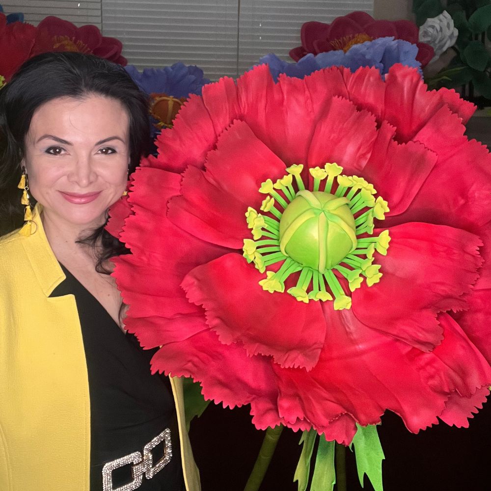
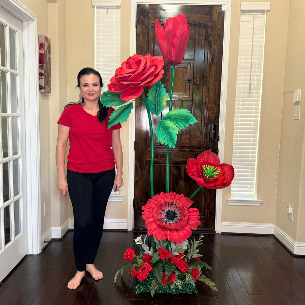
Giant flowers are perfectly positioned for this moment. A 3-foot EVA foam peony in a deep terracotta or a saturated cobalt? That's not just a decoration. That's a statement.
A 2024 Event Marketer report found that visual impact and shareable moments are now the #1 priority for event planners when choosing décor. Color is the fastest way to create that impact. And large-scale floral installations are leading the charge.
Ok, this is where it gets really fun. Let me walk you through each major color direction I'm seeing for 2026 and how I'd build a giant flower palette around it.
This is the color story I am most excited about right now. Burnt sienna, terracotta, warm rust, and toasted almond — these shades are everywhere in 2026 event design. They feel grounded, sophisticated, and incredibly photogenic.
When I first started experimenting with earth tones in giant flowers, I honestly wasn't sure they'd translate. I was so used to pinks and whites. But the moment I finished a 36-inch terracotta dahlia and set it against a cream backdrop? I almost cried. It was that good.
For giant flowers, warm earth tones work beautifully in these combinations:
Our EVA foam sheets in warm amber and terracotta tones are some of our best sellers right now — and I'm not surprised. If you're building a flower wall or a freestanding arrangement for a 2026 event, start with these shades. You will not regret it.
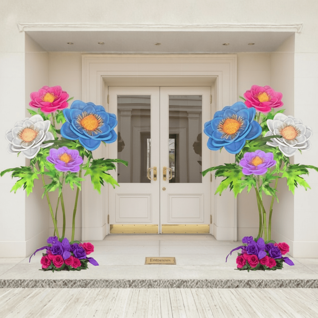
Real talk? Jewel tones never fully left. But in 2026 they're coming back with a confidence that feels different. Deep sapphire, emerald green, amethyst purple, and rich magenta are showing up in event design in a way that feels intentional, not overdone.
According to Brides.com, jewel-toned wedding palettes saw a 47% increase in saves on wedding planning boards in 2024, signaling a strong move toward saturated color in 2025 and 2026 events.
Here's the thing about jewel tones and giant flowers — the scale actually makes them work better. A small sapphire blue flower can look a little costume-y. But a 4-foot sapphire blue peony? That's art. The size gives the color the room it needs to breathe.
I love pairing jewel tones with metallic accents — gold or bronze pipe stems, a hint of gilded edge on the petals. If you want to see how this looks in a full arch build, check out our guide on Giant Flower Wedding Arch: A Complete Guide for 2026. The jewel tone combinations in there are chef's kiss.
My favorite jewel tone pairings for 2026 events:
For quinceañera and sweet sixteen events especially, jewel tones in giant flowers are having a massive moment. I wrote a whole piece on this — Quinceañera Backdrop Ideas: Giant Flowers for 2026 — and the color combinations in there will give you so much inspiration.
Not everyone wants bold. And that's completely valid. The "new neutral" palette for 2026 is softer and more nuanced than what we've seen before. We're talking warm whites, linen, pale sage, soft butter yellow, and blush with a warm undertone — not the cold, grey-leaning blush of five years ago.
According to The Knot's 2025 Real Weddings Study, neutral and soft tonal palettes remain the top choice for weddings, with over 60% of couples choosing palettes built around whites, creams, and soft pastels. But the shift in 2026 is toward warmer, creamier versions of these shades.
When I first started making giant flowers, I ruined so many petals trying to get the perfect warm white. Too cool and it looks clinical. Too yellow and it looks dingy. There's a sweet spot — and it's worth finding.
If you love the all-white aesthetic, I have a detailed guide on exactly how to pull it off beautifully: White Flowers on Wall: A Pro's How-To Guide for 2026. It covers everything from petal shaping to arrangement spacing.
The new neutral palette works especially well for:
- Bridal showers and brunch events: Soft butter yellow + warm white is absolutely dreamy. See more ideas in our Bridal Shower Backdrop Ideas guide.
- Baby showers: Pale sage + linen + soft blush. Gender-neutral and genuinely beautiful. We have a full breakdown in our Baby Shower Backdrop Ideas post.
- Upscale retail displays: Warm cream + champagne. Sophisticated without trying too hard.
- Mother's Day events: Soft peach + warm white + pale lavender. Timeless and so, so pretty.
The key with soft neutrals and giant flowers is texture and layering. When you don't have contrast in color, you need it in form. Mix open blooms with tight buds. Vary your flower sizes between 24 inches and 48 inches. Use different petal shapes. That's what makes a neutral palette feel intentional instead of flat.
How to Build a Color Palette for Your Giant Flower Installation
Ok, so you know the trends. Now let me tell you how I actually build a palette when a customer comes to me. Because knowing the trends is one thing — translating them into a real installation is another.
The first thing I ask is: what is the dominant color in the venue or backdrop? Your giant flowers are going to live in a space, and they need to work with it, not fight it. A deep emerald flower against a dark green wall disappears. That same flower against a warm white wall? Showstopper.
According to HGTV's color theory guides, the most visually impactful color combinations follow either complementary pairing (opposite on the color wheel) or analogous pairing (neighboring colors). Both work beautifully with giant flowers — they just create different moods.
Here's my actual process for building a giant flower color palette:
- Start with your anchor color: This is your dominant flower. Usually the largest bloom, 3-5 feet tall. Pick this first based on the event's primary color story.
- Add a secondary color: This should either complement or sit adjacent to your anchor. Use it for medium-sized flowers, roughly 24-36 inches.
- Bring in a neutral or metallic: Warm white, ivory, champagne, or gold. This is what ties everything together and gives the eye a place to rest.
- Consider your stem and foliage color: Our bendable pipe stems come in multiple finishes. The right stem color can make or break a palette.
- Test before you commit: Order a small sample of your EVA foam sheets before building a full installation. Colors can look different on screen versus in person.
For large-scale installations like arches and backdrops, I always recommend our Bundle Kits — they come with 8-12 flowers starting at $350, which gives you enough variety to build a real color story without ordering everything piecemeal. Browse what's available over at the shop.
If you're building a flower arch specifically, I go deep on structure and color placement in our post on How to Make an Oversized Flower Arch Backdrop. The color placement tips in there are ones I've developed over years of building these things, and they make a real difference.
One more thing I want to say about color and scale — don't be afraid of contrast. I see so many people play it safe and end up with a palette that's beautiful but doesn't photograph well. At events, you're designing for two audiences: the people in the room and the people who will see it on Instagram. High contrast photographs better. A deep burgundy flower next to a warm ivory one is going to stop thumbs on a scroll in a way that an all-blush palette sometimes doesn't.
The WeddingWire 2025 Newlywed Report found that 78% of couples said photos were the most important factor in evaluating their event décor after the fact. Design for the photo. It matters.
And if you're a small business owner or boutique using giant flowers for visual merchandising, color strategy is even more critical. I wrote specifically about this in our Visual Merchandising Ideas for Boutiques guide — because the way you use color in a retail space is a little different from an event, and it's worth understanding the distinction.
For corporate events in 2026, I'm seeing a real shift toward brand-matched color installations. Companies are moving away from generic floral décor and toward custom giant flower installations that match their exact brand palette. If you're an event planner working with corporate clients, this is a huge opportunity. Our 10 Corporate Event Engagement Ideas for 2026 post has a whole section on this.
The US event décor market is growing fast — IBISWorld reports the US floral industry at $7.9 billion, and large-scale decorative installations are one of the fastest-growing segments within it. Clients are spending more, expecting more, and the bar for what looks impressive has genuinely risen. Color is how you meet that bar.
I get asked all the time: "Adriana, what's the one color combination you'd recommend for 2026 if someone is just getting started?" And honestly? Right now it's warm terracotta + dusty sage + ivory. It hits every trend — earth tones, natural warmth, the new neutral — and it works for weddings, baby showers, corporate events, and retail displays. It's versatile, it photographs beautifully, and it feels very of-the-moment without being so trendy it'll look dated in six months.
If you want to see how a full installation comes together in that palette, check out our Freestanding Giant Flower Arrangements for Events: Complete Guide. There are real examples in there that show exactly how these color combinations translate at scale.
Color is the first thing people feel when they walk into a space. Before they read a sign or taste the food or hear the music — they feel the color. Giant flowers let you fill a room with color in a way that nothing else really does. A 4-foot bloom in the right shade doesn't just decorate a space. It transforms it.
Whatever event you're planning, I hope this gave you some real direction. If you're ready to start building your 2026 palette, head over to the Amazing Giant Flowers shop and explore the kits and foam sheets we have available. And if you have questions about color matching or which kit is right for your event — reach out. I actually love talking about this stuff. What color combination are you most excited to try this year?
Ready to Create Something Amazing?
Browse our collection of giant flower kits and start your next project.
Shop All Flowers